
I have been designing printable weight trackers for myself and our community for years, and I can tell you this: the layouts that survive past week three are almost never the prettiest ones. They are the ones that take 30 seconds to fill in, fit on one page, and tell you something useful at a glance.
If you want to know how to design a printable weekly weight-tracking layout that you will actually keep using, this guide walks you through every decision, from paper size to grid spacing to where the motivational quote should go (hint: usually the bottom corner, not the center).
By the end, you will have a complete blueprint for building your own custom layout, plus a checklist of elements that separate trackers people abandon from trackers they use for 3.5 years straight, like the long-term trackers I see over and over in fitness forums.
Table of Contents
- How to Design a Printable Weekly Weight-Tracking Layout That Actually Works
- What Elements Every Weekly Weight Tracker Needs
- Step-by-Step Design Process for Your Weekly Layout
- Weekly vs Monthly vs Daily Tracking Layouts Compared
- Best Design Tools and Software for Building Printables
- Bullet Journal Integration and Habit Tracking Add-Ons
- Common Design Mistakes and How to Avoid Them
- Frequently Asked Questions
- Final Thoughts on Your Printable Weekly Weight-Tracking Layout
How to Design a Printable Weekly Weight-Tracking Layout That Actually Works
A printable weekly weight-tracking layout is a single-page (or two-page spread) template that records your weight, body measurements, and related progress data across seven days. Unlike daily trackers that demand constant entries, weekly layouts balance recording with reflection. You log one weight per day, then sit down once a week to look at the trend.
The reason this format works for most people is friction. Daily trackers become a chore after two weeks. Monthly trackers hide short-term patterns. Weekly sits in the sweet spot where you see daily movement but get weekly context, which is exactly the rhythm most successful long-term trackers report in fitness communities.
A functional layout does three things at once: captures your weight in a way that is easy to enter, displays your trend visually so you do not have to do mental math, and leaves space for the non-scale signals that keep you going when the number stalls.
What Elements Every Weekly Weight Tracker Needs
Every reliable weekly weight-tracking template shares the same five building blocks. Skip any of them and you end up with a layout that looks good on screen but frustrates you in week two.
The Header and Goal Block
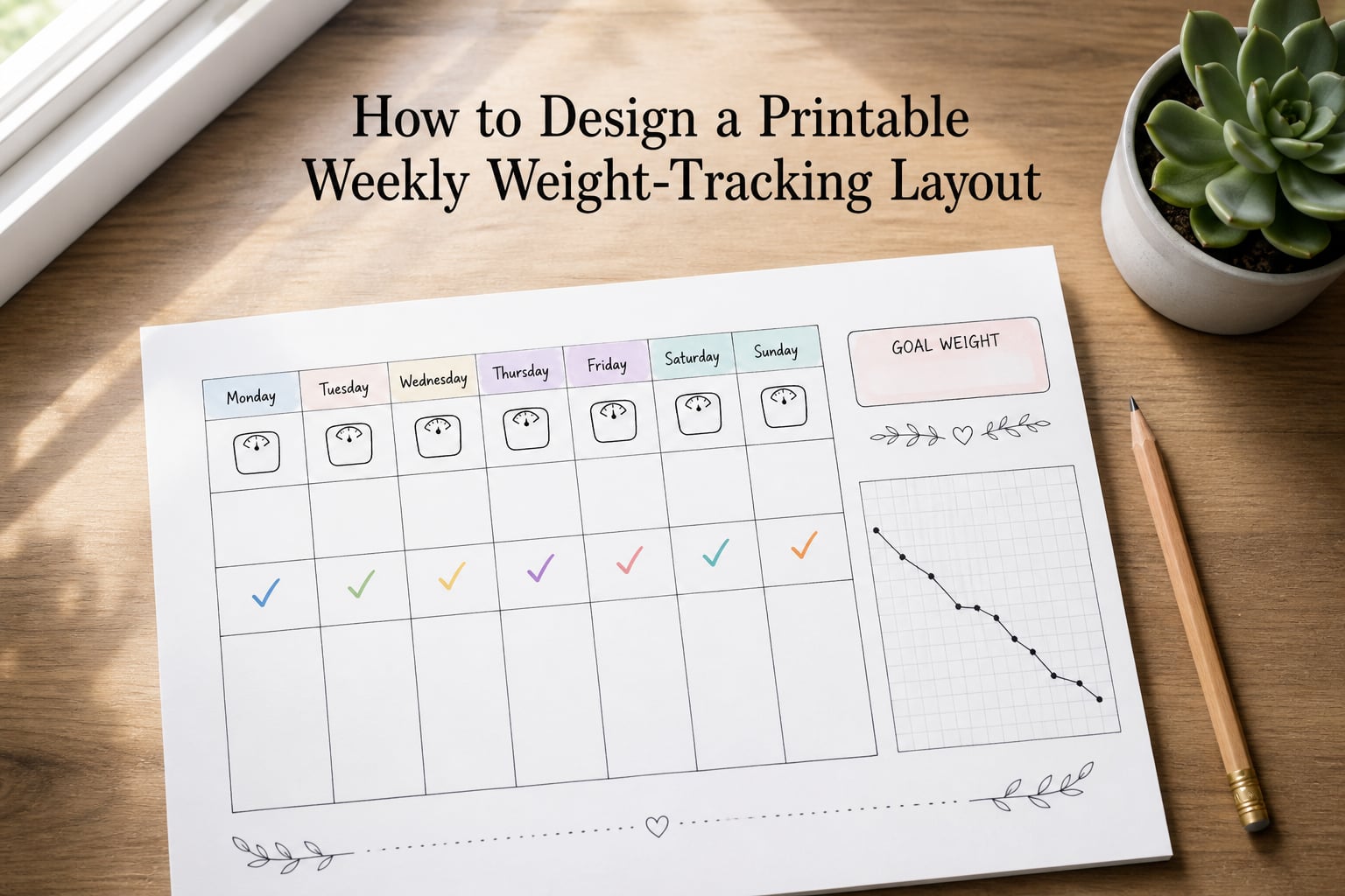
The top of your layout should answer three questions before you log anything: Who is this for? What is the goal? What week is it? A clean header block with fields for your name, starting weight, goal weight, and week number takes up about 1.5 inches of vertical space on a standard letter-sized page.
I always put the goal weight and target date inside a visible box, not buried in tiny text. When the goal is staring at you on Monday morning, you are more likely to weigh in honestly.
The Daily Weight Grid
This is the heart of the layout. A 7-column grid labeled Mon through Sun, with rows for weight, a notes line, and optionally a mood or energy emoji, takes up the middle third of the page. Leave enough space in each cell for a number plus one or two words of context.
The grid should have visible borders. Lines you can see are easier to write inside than dotted guides, especially when you are filling it out half-asleep on Monday. Use a column width of about 1.2 inches and a row height of about 0.5 inches to keep things legible without crowding.
Body Measurement and Notes Area
The bottom third of your layout should hold weekly measurements, a notes section, and a small reflection prompt. Common measurements to log weekly include waist, hips, chest, and thighs. Pick three or four, not all twelve. Tracking too many metrics is one of the fastest paths to tracker fatigue, according to long-term users in r/bujo.
A single reflection prompt at the bottom of the page, such as “What worked this week?” or “What did I learn about my habits?”, turns the layout from a passive log into an active thinking tool. I rotate through three prompts across a 12-week cycle so I never get bored of answering the same question.
Step-by-Step Design Process for Your Weekly Layout
Here is the exact process I walk our readers through. It works whether you are building your first tracker or redesigning your tenth.
Sketch Your Layout on Paper First
Before opening any software, sketch your layout with a pencil on plain paper. Erin Condren’s design team recommends this approach and I agree: sketching first prevents you from committing to a grid that looks fine on screen but feels cramped when you actually write in it.
Draw a rough rectangle representing your page, then divide it into the five zones: header, daily grid, measurements, notes, and visual progress. Spend five minutes on this step. It saves an hour of rework later.
Choose the Right Paper Size and Orientation
Letter (8.5 by 11 inches) is the most common size because every home printer handles it. A4 works equally well if you are outside North America. For one-page weekly layouts, portrait orientation fits the seven-day grid naturally. For two-page spreads where you want room for measurements, photos, or habit tracking, go landscape.
If you want a smaller planner-friendly size, design at half-letter (5.5 by 8.5 inches) and scale everything proportionally. Do not design at quarter-letter unless you enjoy squinting. The text becomes too small for weekly entries.
Build Your Grid With Software
Pick a tool and stick with it. For most people, that means one of four options: Microsoft Excel or Google Sheets for pure data grids, Microsoft Word or Google Docs for text-heavy layouts with simple tables, Canva or Adobe Express for visual layouts with custom graphics, or InDesign for professional print quality.
If you only need a clean grid with rows and columns, Excel is fastest. Set your page size in print settings, freeze your column widths, and add borders. If you want a layout with icons, color blocks, or motivational graphics, use Canva’s free printables templates and customize from there.
Add Visual Progress Elements
A small line chart or bar graph that fills in as you log weights turns your tracker into a story. The chart does not need to be fancy. A simple graph with weeks on the x-axis and weight on the y-axis, drawn in a 2-by-3-inch box, is enough.
Color-code your grid so completed days look different from blank ones. Light gray for empty cells, white for filled cells, and a small green check or colored border once the day is logged. This visual reward is one of the most common features in trackers that last more than a year.
Test Print and Adjust Spacing
Print a test page before you commit to a design. Fill it in with realistic handwriting sizes, not your neatest cursive. If the daily grid cells cannot fit a four-digit weight like 198.4 plus a short note, the cells are too small.
Check the print margins. Most home printers leave a 0.25 to 0.5-inch non-printable border. Anything you put in that margin will be cut off. Move important content at least 0.4 inches from the page edge.
Weekly vs Monthly vs Daily Tracking Layouts Compared
Each tracking cadence serves a different purpose, and the right choice depends on how you actually behave over time. Here is the comparison I wish someone had shown me when I started.
| Cadence | Best For | Pros | Cons |
|---|---|---|---|
| Daily | Detailed pattern-spotting, athletes, plateau breakers | Catches water weight swings, hormonal cycles, and food reactions | High friction, easy to abandon, scale noise can discourage |
| Weekly | Most people on a weight loss journey | Low effort, smooths out daily noise, easy weekly review | Misses short-term patterns, can feel slow during stalls |
| Monthly | Long-term maintenance, big-picture tracking | Minimal effort, focuses on overall trend | Hides plateaus and breakthroughs, low accountability |
Most successful long-term trackers use weekly as their default and add daily tracking only when breaking through a plateau or troubleshooting a stall. I run weekly layouts 80 percent of the year and switch to daily when I notice the scale stuck for three weeks in a row.
Best Design Tools and Software for Building Printables
You do not need expensive software to design a clean weekly weight tracker. Here is what I recommend for each skill level.
For beginners, Canva’s free tier is the fastest path to a polished layout. The template library includes dozens of weight tracker and fitness journal layouts you can customize in minutes. Drag and drop your daily grid, swap the colors, and export as a print-ready PDF.
For spreadsheet users, Google Sheets and Excel both work well. The advantage is automatic chart generation. As you type weights into the grid, your line chart updates in real time. The downside is visual design is limited to what your spreadsheet program can render, which is functional but rarely beautiful.
For designers comfortable with Adobe, InDesign or Affinity Publisher give you full control over typography, color, and print bleed. This is overkill for most people, but if you plan to sell printable trackers or distribute them in a planner bundle, the investment pays off in production quality.
For bullet journal fans, no software is needed. Draw your layout by hand using a ruler and a fine-tip pen. The bujo community’s emphasis on rapid logging means your hand-drawn layout only needs the essentials: a header, a seven-day grid, and a small notes area. Skip the decorative borders unless you genuinely enjoy drawing them.
Bullet Journal Integration and Habit Tracking Add-Ons
The most popular bullet journal spreads combine weight tracking with one or two related habits. Adding too many elements is the classic mistake. I see people abandon trackers because they tried to track weight, calories, water, sleep, mood, exercise, and gratitude on one spread. That is six things a day, every day. It does not survive contact with real life.
Pick two add-ons at most. The pairings that work best in long-term journals are weight plus water intake, weight plus mood or energy, or weight plus a single fitness habit like daily steps. Spread these across the page so each has its own visual zone without crowding the weight grid.
A simple habit tracker row beneath your daily grid, with seven small boxes for yes/no completion, is enough. Filling in those boxes creates a visible chain that motivates consistency, and it takes two seconds per day.
Common Design Mistakes and How to Avoid Them
After watching hundreds of trackers succeed and fail, here are the design mistakes that kill consistency and how to fix each one.
Cramming too much on one page. If your layout needs a magnifying glass to read, it will not get used. Cut elements until everything is legible at arm’s length. A clean, sparse layout beats a busy one every time.
Tracking too many metrics. If your tracker has weight, body fat percentage, calories, water, sleep, mood, energy, and exercise all in one weekly view, you have built a chore, not a tool. Pick three to five metrics maximum and drop the rest.
Putting the goal weight in tiny text. The goal is the whole point of the tracker. Make it bold, large, and at the top of the page. When you see it, you remember why you are filling in the grid.
Forgetting the review prompt. Without a weekly reflection question, your tracker is just a list of numbers. The reflection turns numbers into learning, and learning is what keeps you going during plateaus. Add a single open-ended prompt at the bottom of every week’s layout.
Designing only for your best-case scenario. If your layout has no space for bad weeks, you will stop using it the first time you have one. Build in a “what got in the way” line or a small grace column. Progress is not linear, and your tracker should reflect that.
Frequently Asked Questions
How do I create my own weight loss plan?
Start by setting a realistic weekly goal, building a weekly weight-tracking layout with a goal header, daily grid, and notes section, then log your weight the same day each week. Review the trend every Sunday and adjust your plan based on what the data shows rather than how you feel in the moment.
What are some creative ideas for a weight loss bullet journal?
Combine your weekly weight grid with a habit tracker row, a mood or energy column, and a small sketch or sticker area for milestones. Use color-coded pens for different metric types and rotate your weekly reflection prompt across a 12-week cycle so you never answer the same question twice in a row.
What are some popular bullet journal spreads?
Weekly weight tracker, habit tracker, mood log, meal planning spread, fitness log, gratitude list, and sleep tracker are the most popular spreads in weight loss bullet journals. Combining two or three of these on a single spread keeps the layout sustainable and avoids the spread creep that leads to abandoned journals.
Can you provide an Excel template for weight tracking?
Yes. In Excel or Google Sheets, set your page size to letter, create a seven-column grid labeled Monday through Sunday, add a goal header in the top rows, and insert a line chart with weeks on the x-axis and weight on the y-axis. Freeze the header row and add cell borders so the layout prints cleanly at home.
What is the 3-3-3 rule to lose weight?
The 3-3-3 rule is a simple structure for sustainable weight loss: eat three balanced meals a day, do 30 minutes of movement three times a week, and drink three liters of water daily. A printable weekly weight-tracking layout pairs well with this rule because the daily grid gives you a place to check off each component without adding a second tracking system.
What is the 50/30/20 rule for weight loss?
The 50/30/20 rule splits your plate into 50 percent vegetables, 30 percent lean protein, and 20 percent complex carbohydrates or healthy fats. It is a portion framework, not a tracking system, so combining it with a weekly weight tracker lets you correlate how your meals match the framework with what the scale shows each week.
Final Thoughts on Your Printable Weekly Weight-Tracking Layout
The best layout is the one you actually use on week twelve, not the prettiest one you design on day one. Start with the five essentials, sketch it on paper, build it in your tool of choice, test print, and iterate. Your printable weekly weight-tracking layout is a living tool, not a finished product.
Once your template is ready, print a 12-week bundle and commit to filling it in every morning. By week three, the habit will be automatic. By week twelve, you will have a record of your journey that no app can match.