
I built my first Google Sheets weight tracker during a frustrating plateau three years ago. After weeks of staring at raw numbers in a column, I gave up. The numbers told me nothing about whether I was making real progress.
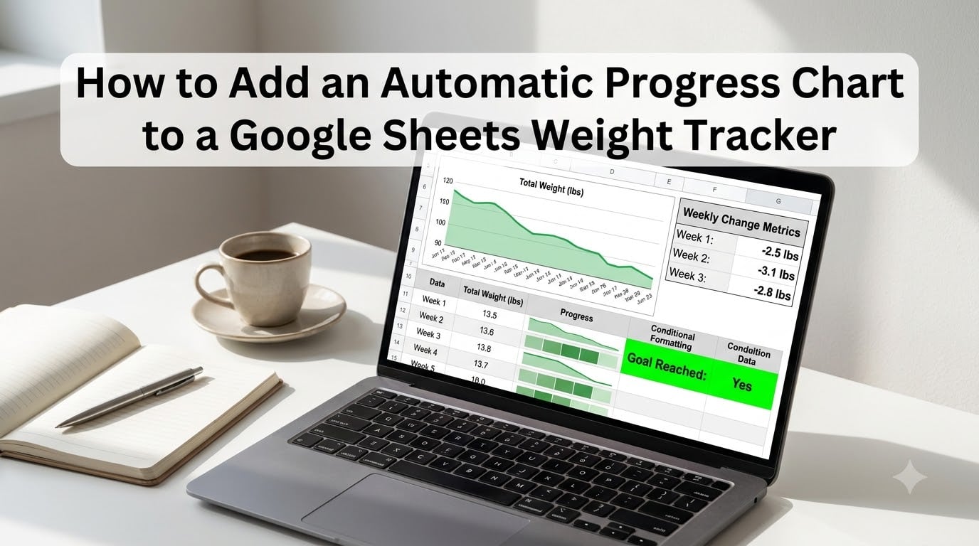
Everything changed when I added an automatic progress chart. The chart updated itself every time I weighed in, and the visual trend finally showed me what the numbers could not. In this guide, I will walk you through exactly how to add an automatic progress chart to a Google Sheets weight tracker, from the first column to a finished dashboard you can check from your phone.
Table of Contents
- What Is an Automatic Progress Chart in Google Sheets
- How to Set Up Your Weight Tracker Data Structure
- How to Add Automatic Calculations with Formulas
- How to Create a Progress Bar with the SPARKLINE Formula
- How to Create a Dynamic Line Chart for Weight Loss Progress
- How to Add a Trendline for Smoother Insights
- How to Apply Conditional Formatting for Visual Cues
- How to Build a Simple Dashboard View
- Tips for Mobile Viewing and Sharing Your Tracker
- Frequently Asked Questions
- Final Thoughts
What Is an Automatic Progress Chart in Google Sheets
An automatic progress chart in Google Sheets is a visual representation of your weight entries that updates the moment you add a new row of data. You do not have to edit the chart, drag ranges, or rebuild anything.
The chart pulls directly from your data table. When you type today’s weight in the next row, the chart line extends on its own. This is what makes it “automatic.”
I rely on three pieces working together: a clean data table, a few helper formulas, and a chart object linked to that table. Once they are wired up, weekly weigh-ins take less than ten seconds and the visuals stay current.
If you have ever abandoned a tracker because updating it felt like a chore, this setup removes that friction. You weigh in, type the number, and the chart does the rest.
How to Set Up Your Weight Tracker Data Structure
Every automatic progress chart starts with a clean data table. Before you touch any formula or chart button, build these columns in row 1.
Here is the layout I use across Row 1, starting at cell A1:
- A1: Date
- B1: Weight (lbs)
- C1: Weekly Change
- D1: Total Loss
- E1: Progress Bar
Keep your starting weight in a separate cell. I usually drop it in cell G1 and label it “Starting Weight.” You will reference that cell later when you calculate progress toward your goal.
Now enter your weigh-ins. Put the date in column A using a real date format like 2026-08-01. Put the weight in column B as a plain number. Try to weigh in at the same time of day, ideally first thing in the morning, so day-to-day changes reflect real shifts rather than hydration swings.
One quick formatting tip: select column B, click Format, then Number, then Number. This locks the weight to two decimal places so 174.25 does not accidentally become 174.3.
How to Add Automatic Calculations with Formulas
Raw weights tell a partial story. The change between weigh-ins and your total loss tell the rest. Let me show you the three formulas I add to every tracker.
In cell C2 (Weekly Change), enter this formula and drag it down:
=B2-B1
This shows how much you lost or gained between entry 1 and entry 2. A negative number means weight loss, which is what most of us want to see.
In cell D2 (Total Loss), enter this:
=$G$1-B2
The dollar signs create an absolute reference. When you drag this formula down, it always points back to your starting weight in G1. The result is the running total of pounds lost from your starting point.
For an average weekly loss in cell F1, use:
=AVERAGE(C2:C100)
I extend the range to row 100 even though I only have five entries. The formula ignores empty cells, so it grows with your data automatically.
After these formulas are in place, every new weigh-in row will calculate itself. You will see the weekly change and total loss update the moment you type a new weight.
How to Create a Progress Bar with the SPARKLINE Formula
The SPARKLINE function is the secret weapon behind many Google Sheets trackers. It draws a tiny chart inside a single cell, which is perfect for a quick visual progress indicator.
Click into cell E2 and enter this formula:
=SPARKLINE(B2,{"charttype","bar";"color","#34a853";"max",$G$1;"min",$G$1-20})
Let me break down what each piece does. The charttype argument tells Sheets to draw a horizontal bar. The color argument sets it green, which I associate with healthy progress. The max and min arguments set the scale based on your starting weight and a 20-pound goal below it.
Once you have it working in E2, drag the formula down through the rest of column E. Each row will show a bar whose length reflects how close that week's weight is to your goal.
If the bars look too thin, increase the column width by double-clicking the column E border. If you want a different color, swap the hex code. I use #34a853 for progress and #ea4335 when I want to flag regressions.
SPARKLINE works without any chart setup. It is the fastest way to add visual feedback to a column of numbers, and it updates the moment you change a weight.
How to Create a Dynamic Line Chart for Weight Loss Progress
SPARKLINE bars are great in a column, but a full line chart tells the bigger story. This is the part most beginners get stuck on, so I will walk through it step by step.
Step 1: Select your data. Click cell A1, then hold Shift and click cell B1 to highlight the headers. Hold Shift again and click the last cell in column B that has data, such as B12.
Step 2: Insert the chart. Click Insert in the menu, then Chart. Google Sheets opens the Chart editor on the right.
Step 3: Pick the chart type. In the Setup tab, change the Chart type dropdown to Line chart. A clean line chart shows weekly weigh-ins better than any other style.
Step 4: Link to your data range. Switch to the Data tab in the Chart editor. Under "X-axis," choose the Date column. Under "Series," make sure Weight is selected. Sheets will automatically pull from your table.
Step 5: Move the chart to its own tab. Click the three dots in the chart's top-right corner and choose "Move to own sheet." I name this tab "Progress Chart." The chart now lives on a clean canvas without overlapping your data.
Step 6: Test the auto-update. Go back to your data sheet and add a new row with today's date and weight. Switch back to the chart tab. The line should extend to include your new entry without any extra clicks.
This is the part I love. Once the chart is set up correctly, future entries flow into the chart automatically. You never have to drag ranges or edit the chart again.
How to Add a Trendline for Smoother Insights
Daily weight bounces around. Water, salt, sleep, and hormones all push the number up and down. A raw line chart can make a steady weight loss look like a roller coaster.
A trendline smooths those swings. It draws a straight line through your data that shows the underlying direction.
To add one, double-click your chart to reopen the Chart editor. Go to the Customize tab, then scroll to the "Series" section. Check the box for Trendline. You will see a straight line appear on top of your weight curve.
Choose Linear for a straight trendline or Moving average for a curved one that recenters with new data. I prefer the moving average because it adapts as I add weigh-ins.
The trendline reveals the actual pace of your progress. If your weekly weight jumps up by 2 pounds but the trendline slopes down, you are still on track. The noise is just noise.
How to Apply Conditional Formatting for Visual Cues
Numbers tell the truth, but colors speak to motivation. Conditional formatting paints each cell based on its value, so good weeks glow green and rough weeks stand out in red.
Select column C (Weekly Change). Click Format, then Conditional formatting. Under "Format rules," choose "Less than" and enter 0. Set the fill color to a soft green. This highlights every week you lost weight.
Add a second rule for the same column. Choose "Greater than" 0 and set the fill to a light red. Now weight gain weeks pop visually.
For column D (Total Loss), apply a color scale. Choose "Color scale" under Format rules and pick a gradient from white at zero to deep green at your goal weight. The deeper the green, the closer you are to your target.
This setup gives you a glance-friendly tracker. You can scan down a column and immediately see your best and worst weeks without reading a single number.
How to Build a Simple Dashboard View
Once the data table and chart are working, a dashboard pulls the most important numbers onto a single screen. I use mine every morning.
Create a new tab called "Dashboard." In cell B2, pull your current weight with this formula:
=INDEX('Sheet1'!B:B,COUNTA('Sheet1'!B:B))
The INDEX and COUNTA combination grabs the last non-empty cell in your weight column. As long as you never leave blank rows between entries, this always shows your latest weigh-in.
In B3, show total loss:
=$G$1-B2
In B4, show your average weekly change. Reference the average formula from your data tab.
Underneath those numbers, add a copy of your progress chart. Click the chart on its tab, choose "Move to current sheet," and drag it under your dashboard metrics. Now everything you need sits on one page.
Tips for Mobile Viewing and Sharing Your Tracker
Most weigh-ins happen in the bathroom, not at a desk. Make sure your tracker works on your phone.
Open the Google Sheets app on your phone and find your file. The line chart renders well on mobile, and the dashboard tab is the one to bookmark. Tap the star icon next to the tab name to keep it pinned.
If you want to share progress with a coach or accountability partner, click Share in the top-right of Sheets and enter their email. Set their permission to "Viewer" so they can see your chart but not edit your numbers.
For daily motivation, add your dashboard tab to your phone's home screen. Most phones let you save a Google Sheets tab as a shortcut with a single tap.
Frequently Asked Questions
How do I insert a progress tracker in Google Sheets?
Open your Google Sheets file, build a two-column data table with Date in column A and Weight in column B, then insert a Line chart from the Insert menu. The chart will read directly from your table, so each new weigh-in row appears on the chart automatically. For a quick visual indicator inside a cell, use the SPARKLINE formula with charttype set to bar.
How to create a weight loss tracker on Google Sheets?
Start with headers Date, Weight, Weekly Change, Total Loss, and Progress Bar in row 1. Enter your weigh-ins starting in row 2, add formulas for weekly change and total loss using absolute references to your starting weight, then insert a Line chart to visualize the trend. Optional add-ons include a SPARKLINE progress bar and a dashboard tab with summary metrics.
How to make a graph in Google Sheets that updates automatically?
Select your data range including headers, click Insert, then Chart, then choose Line chart. As long as you add new rows directly below your existing data, the chart will extend automatically. Avoid leaving blank rows in the middle of your data because that breaks the connection between the table and the chart.
How to make a chart for weight loss?
Build a simple two-column table with Date and Weight, then insert a Line chart from the Insert menu. Set the X-axis to the Date column and the series to Weight. Add a trendline through the Customize tab to smooth out daily fluctuations, then move the chart to its own tab for a cleaner view.
Final Thoughts
An automatic progress chart in Google Sheets turns a boring data column into a clear picture of your weight loss journey. Set up the data table once, add the formulas, insert the line chart, and you have a tracker that updates itself every time you weigh in.
Start with the SPARKLINE progress bar today. It takes one minute and gives you immediate visual feedback. Once you see that first bar shrink, you will want to build out the rest.