
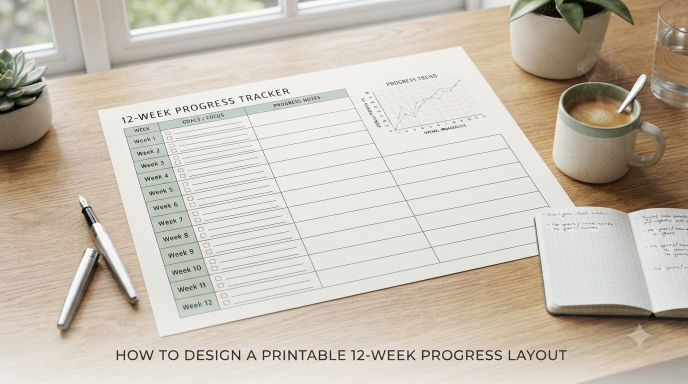
I built my first 12-week progress tracker on a half-used legal pad, and the columns were so cramped I could barely fit a number in each box. Two weeks in, I gave up.
That failed experiment taught me something every planner designer eventually learns: a good printable 12-week progress layout is not about squeezing 12 weeks onto one page. It is about giving each week enough room to breathe, choosing the right metrics, and designing for the way you actually write.
If you have ever downloaded a generic tracker that did not quite fit your goals, this guide is for you. I will walk you through the design process from a blank canvas to a print-ready file, including the software tools I recommend, the mistakes I made so you do not have to, and the customization tweaks that turn a generic grid into your personal accountability system.
Table of Contents
- What Is a 12-Week Progress Layout and Why It Works
- Essential Elements Every Progress Layout Needs
- Step-by-Step Design Process
- Best Design Tools for Creating Your Layout
- Customization Tips for Your Personal Goals
- Print Setup and Optimization
- Common Design Mistakes to Avoid
- Frequently Asked Questions
- Start Designing Your Own Printable 12-Week Progress Layout Today
What Is a 12-Week Progress Layout and Why It Works
A printable 12-week progress layout is a one-page or multi-page planning template that divides your goals into 12 weekly segments, with room to track metrics like weight, measurements, workouts, or habits for each week.
The idea comes from the 12 Week Year methodology, popularized by Brian Moran. Instead of setting annual goals that lose steam by February, you compress a year’s worth of execution into 12-week sprints. Each sprint gets its own scoreboard, weekly review, and reset cycle.
Research on goal-setting cycles backs this up. Shorter feedback loops increase follow-through because you see results faster and adjust course before bad habits calcify. A printable tracker makes that feedback loop tangible. You can hold it, check off boxes, and watch your own handwriting fill in the proof that you showed up.
For weight loss specifically, 12 weeks is long enough to lose 12 to 24 pounds safely (about 1 to 2 pounds per week), and short enough to stay motivated without the burnout that derails year-long resolutions.
Essential Elements Every Progress Layout Needs
Before you open any design tool, lock in the core elements your layout must include. These five components form the skeleton of any effective 12-week progress tracker.
1. Twelve Weekly Rows or Columns
The structural backbone is a grid with 12 rows (one per week) and 3 to 6 columns (one per metric). Vertical layouts work better for wall posters, while horizontal layouts work better for binders and planner inserts.
2. Metric Columns That Match Your Goal
Common columns include start weight, current weight, weekly change, body measurements, calories, workout sessions, and habit checkmarks. Pick 4 to 6 metrics max. More than that and the layout becomes unreadable.
3. A Header Section With Goals and Targets
Reserve the top 15 to 20 percent of your page for your goal statement, starting metric, and target metric. Write the goal in present tense: “I weigh 165 pounds by [date].” That sentence is the anchor you read every time you open the tracker.
4. Milestone Markers
Add visual breaks at weeks 4, 8, and 12. These represent one-month, two-month, and end-of-cycle checkpoints. A small icon, color band, or shaded row signals that it is time for a deeper review.
5. A Weekly Reflection Field
Include a small box at the bottom of each row for a one-line note: what worked, what to adjust, how you felt. A weekly reflection field turns raw data into insight.
Step-by-Step Design Process
Here is the exact workflow I use when designing a printable 12-week progress layout from a blank canvas. Follow these steps in order and you will end up with a tracker that is both functional and visually clean.
Step 1: Define Your Goal and Metrics
Write down one specific goal in measurable terms. “Lose weight” is not specific. “Lose 15 pounds by December 31” is. Once the goal is locked, list every metric that helps you measure progress toward it. If you are tracking weight loss, that means weight, body measurements, and perhaps weekly workout count. If you are tracking habit formation, that means daily checkboxes and a streak counter.
Circle the 4 to 6 most important metrics. Everything else is noise.
Step 2: Choose Your Layout Grid
Decide between three common grid structures:
- Vertical weekly rows: Best for tracking few metrics across many weeks. Easy to read at a glance.
- Horizontal weekly columns: Best for tracking many metrics across a few weeks. Good for landscape page orientation.
- Calendar block layout: Best if you want to track daily habits within each week. More complex to design but offers finer granularity.
For most weight loss and fitness goals, the vertical weekly rows layout wins because you scan your progress over time, not within a single week.
Step 3: Build the Columns and Headers
Open your design tool and set up the grid. In Canva, use the Table element. In Excel, freeze the header row. In Google Sheets, use the first row for bold headers. Each column header should be short (one to two words) so the tracker fits on a standard 8.5 by 11 inch page.
Leave at least 0.5 inches of margin on all sides. Printers need that buffer, and your hand needs space to write without bumping the edge.
Step 4: Add Visual Elements
This is where most DIY trackers fall flat. Add three visual elements to elevate your layout:
- A small line graph in the corner showing your starting and target weight, with a dotted line you can fill in weekly.
- Color bands for milestones at weeks 4, 8, and 12. Use light gray shading so handwriting stays visible.
- A checkmark icon or star symbol in the habit column. Symbols are faster to draw than numbers.
Keep the color palette to two or three colors. More than that and the page looks cluttered.
Step 5: Test Readability Before Printing
Print one test page on plain paper and fill in fake data with the pen you plan to use. If your handwriting does not fit, shrink the column count or widen the rows. If the page feels crowded, drop one metric. The 30-second test catches problems that look invisible on screen.
Best Design Tools for Creating Your Layout
I have built printable trackers in every major design tool over the past three years. Here is how the top options stack up for a 12-week progress layout.
Canva: Best for Visual Beginners
Canva wins on drag-and-drop simplicity. Search “weekly planner” in the templates library, duplicate it, and start swapping in your columns. The free tier handles everything you need. Canva exports directly to PDF, which prints cleanly. The downside is limited table editing. Once you exceed 6 columns, the table starts to feel cramped.
Excel or Google Sheets: Best for Data Tracking
Spreadsheets are the best choice if your tracker is heavy on numbers. Cell formatting lets you add borders, color bands, and formulas (for example, a weekly change column that auto-calculates). Export to PDF before printing by going to File > Save As > PDF. Google Sheets works the same way and adds cloud backup.
Adobe Illustrator or InDesign: Best for Custom Precision
If you want pixel-perfect typography, custom icons, or a planner you plan to sell, go professional. Both tools offer master pages, bleed settings, and grid snapping that hand-drawn templates cannot match. The learning curve is steep, so this option only makes sense if you plan to design multiple layouts.
Hand-Drawn: Best for Bullet Journal Fans
Skip software entirely. Grab a ruler, a fine-tip pen, and a sheet of grid paper. Hand-drawn layouts offer maximum personalization and zero software overhead. The trade-off is that your handwriting becomes part of the design, which is either a feature or a bug depending on your penmanship.
Customization Tips for Your Personal Goals
A generic tracker works, but a personalized tracker gets used. Here is how to adapt the core layout for three common goals.
Weight Loss-Focused Columns
Use weight, waist measurement, weekly workouts, water intake, and a one-line reflection. Skip daily calorie counting unless that is genuinely how you stay accountable. Most people lose weight more sustainably by tracking weekly trends, not daily numbers.
Fitness and Strength Tracking Fields
Swap weight columns for workout type, sets and reps, rest days, and a personal record (PR) column. A 12-week strength cycle is a popular training block because it lines up neatly with mesocycle programming.
Habit Formation Variations
Replace the metric columns with habit categories: sleep, water, reading, meditation, screen time. Use a simple checkbox per day, then aggregate weekly totals at the bottom of each row. This converts the 12-week grid into a habit scoreboard.
Print Setup and Optimization
A great design fails if the print output looks wrong. Three settings make the difference between a clean tracker and an unusable mess.
Page Size and Orientation
Use US Letter (8.5 by 11 inches) or A4 for standard printers. Choose landscape orientation if your layout has more columns than rows. Choose portrait if your layout is row-heavy. Test both before committing.
Margin and Bleed Settings
Set margins to at least 0.5 inches on all sides. If you are taking the file to a professional printer, add 0.125 inch bleed and crop marks. For home printers, skip the bleed but keep generous margins so the printer’s edge tolerance does not cut off your headers.
Color vs Black-and-White Printing
Design with grayscale in mind. A tracker that looks great in color but turns into an unreadable gray blob in black-and-white printing is a tracker people abandon. Use bold headers and thick grid lines so structure survives without color.
Common Design Mistakes to Avoid
I have made every one of these mistakes. Save yourself the trouble by learning from them upfront.
Cramming Too Many Fields
The most common error is trying to track everything. If your tracker has 10 columns, none of them get used. Cut your metrics to 4 or 5 and you will actually fill in the boxes.
Ignoring Font Size for Handwriting
A font that looks crisp on screen can be unreadable when you write over it. Use a minimum 10-point font for headers and 12-point for body labels. Test with your actual pen before committing to a final design.
Forgetting Progress Visualization
A grid of numbers tells you what happened, but a small line graph tells you the story. Always include at least one visual element that shows trend over time. The brain reads trend lines faster than it reads columns of digits.
Designing Without a Review Section
A tracker that records numbers but does not prompt reflection is a logbook, not a planning tool. Add the weekly reflection field at the bottom of each row. It is the difference between data collection and actual progress.
Frequently Asked Questions
What is the 12 week year concept?
The 12 Week Year is a goal-setting methodology that compresses annual goals into 12-week execution cycles. Instead of setting New Year’s resolutions that fade by February, you treat each 12-week block as its own year with specific goals, weekly scorecards, and accountability reviews. The shorter cycle creates urgency and produces faster feedback on what is working.
Can you provide an example of a 12-week year plan?
A typical 12-week plan includes a goal statement, weekly tracking rows for weight or metrics, milestone checkpoints at weeks 4, 8, and 12, and a weekly reflection field. For weight loss, an example is: lose 15 pounds in 12 weeks by tracking weekly weight, weekly workouts, water intake, and writing one reflection per week on what worked.
How to structure a 12 week year?
Structure a 12-week year by defining one measurable goal, choosing 4 to 6 weekly metrics, building a 12-row grid, adding milestone markers at weeks 4, 8, and 12, and reserving space for weekly reflection notes. Review progress every Friday and adjust tactics weekly rather than waiting until the end of the cycle.
How much weight can I safely lose in 12 weeks?
Most health guidelines recommend losing 1 to 2 pounds per week, which means 12 to 24 pounds over 12 weeks is a safe and realistic range for most adults. Losing more than 2 pounds per week typically requires medical supervision and is not sustainable without structured support. Your starting weight, activity level, and adherence all affect the actual number.
Start Designing Your Own Printable 12-Week Progress Layout Today
You now have a complete design process for building a printable 12-week progress layout that actually fits your goals. The competitors in this space hand you a template and hope it works. You now have the framework to design one that is yours from the first column header to the last reflection box.
Pick your tool, lock in your goal, choose 4 to 6 metrics, and build the grid today. Twelve weeks from now, you will have a tracker full of proof that you showed up.